


Poor mobile usability and difficult navigation

Slow loading times on smartphones

Broken layouts on different screen sizes

Inconsistent branding across devices

Higher bounce rates from mobile users
Lost conversions due to poor user experience


01
User & Device Research
We analyze how your audience accesses your product and identify the most important devices and screen sizes.

02
Mobile-First Strategy
We begin designing for mobile screens first, prioritizing essential content and actions.

03
Respnsive Layout Planning
Flexible grid systems and scalable UI components are created to adapt across devices.

04
UI Design & Prototyping
Our team designs responsive interfaces and interactive prototypes for testing across different screen sizes.

05
Optimization & Performance Testing
We optimize images, layouts, and interactions to ensure fast load times and smooth usability.

06
Cross-Device Testing & Launch
Before launch, we test the design on multiple devices and browsers to ensure a flawless experience.
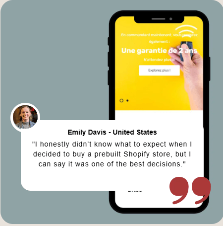


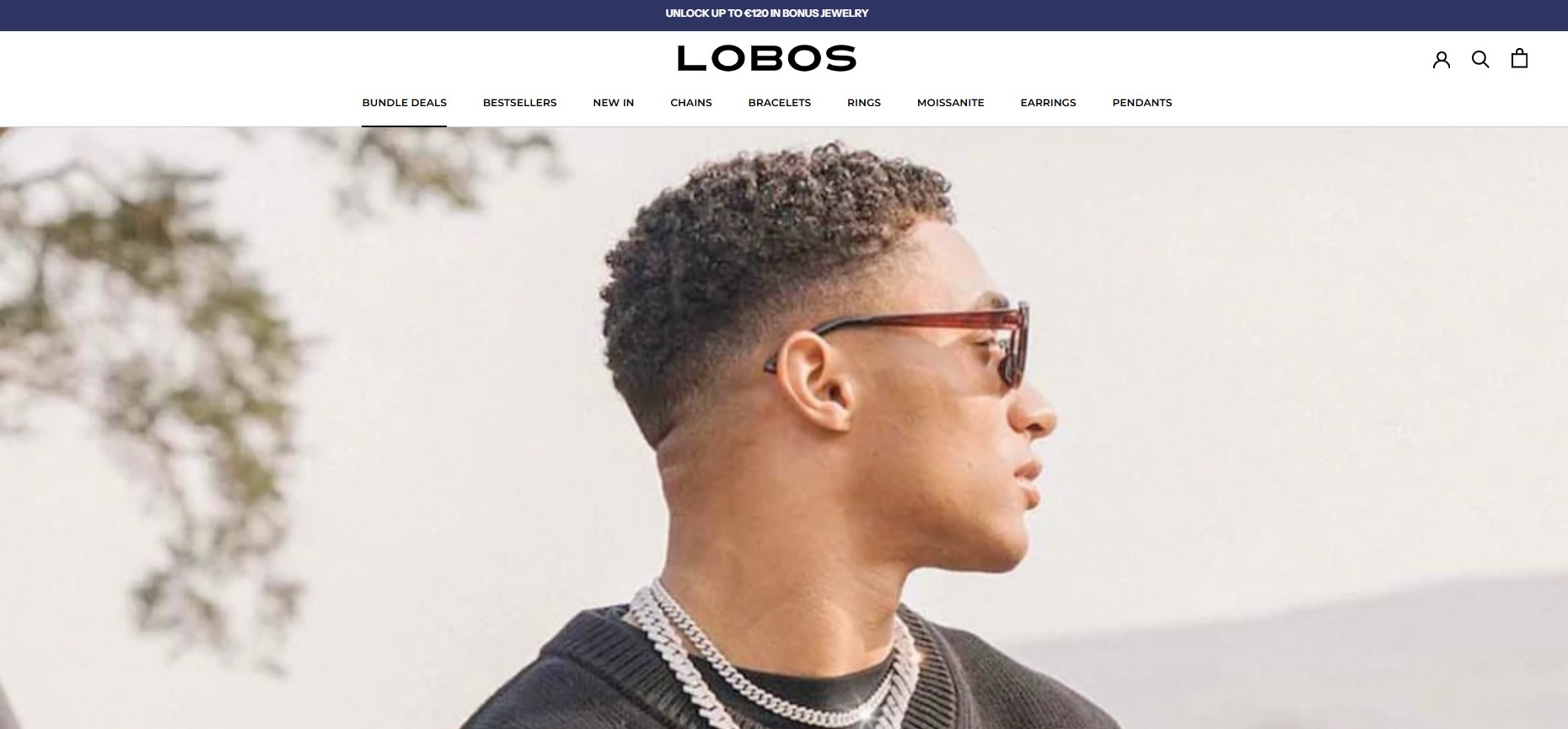
Shopify Development
billigje welers – project

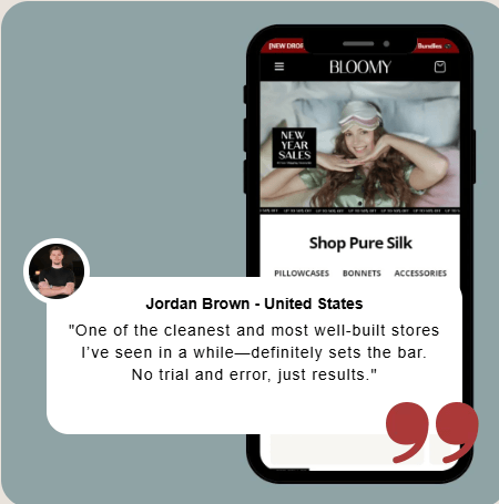
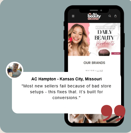
Shopify Development
billigje welers – project
Shopify Development
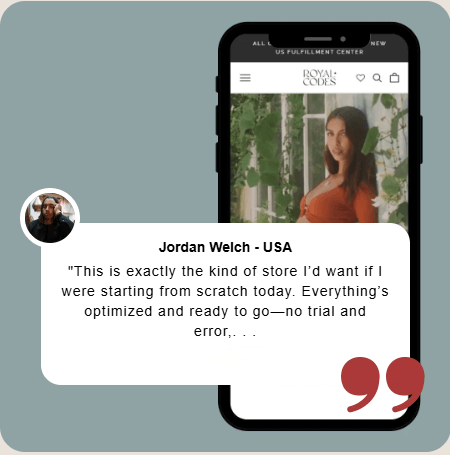
Lawrence Jayaraj Author
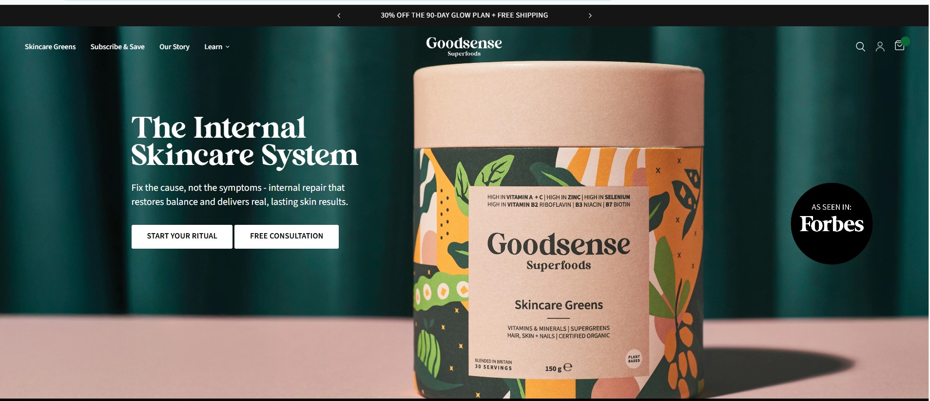
Shopify Development
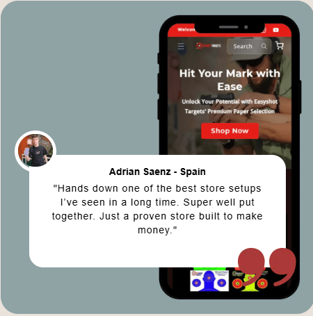
goodsensesuperfoods – Project
Shopify Development
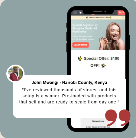
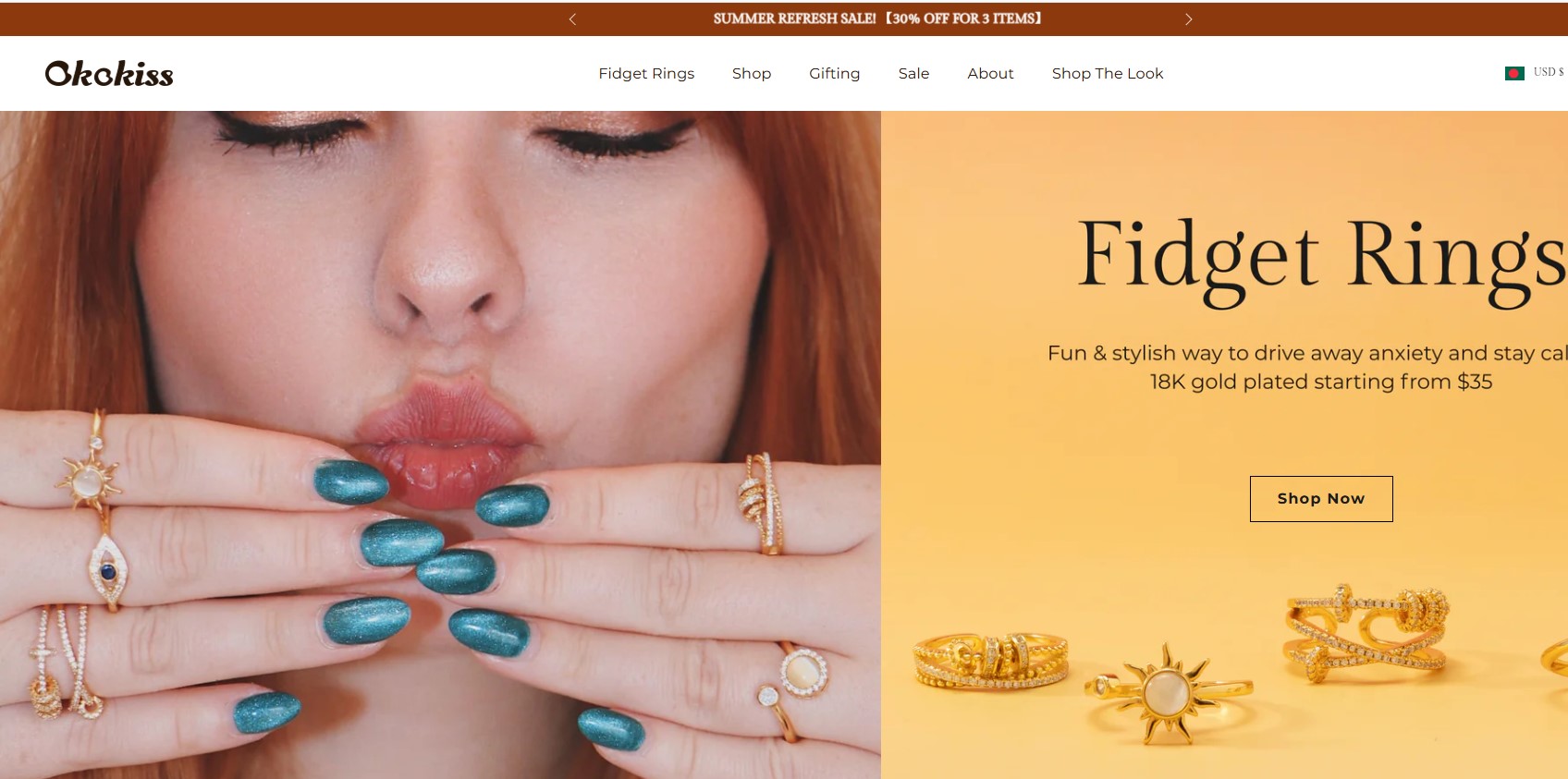
okokiss – Project