


Mobile shopping is no longer just a growing trend — it is now the primary way customers interact with online stores. For most Shopify businesses, the majority of website traffic comes directly from smartphones. Customers browse products while commuting, relaxing at home, or scrolling through social media. This shift in behavior means that if your store is not optimized for mobile users first, you are potentially losing a significant portion of your revenue. Mobile-first Shopify design focuses on building the entire shopping experience primarily for mobile devices before adapting it to desktop. Instead of designing for large screens and later trying to compress everything into a smaller format, mobile-first thinking ensures that every interaction is smooth, fast, and intuitive from the start.
At Zilancer, mobile-first design is not an optional feature — it is a foundation for building high-performing Shopify stores. When mobile usability improves, sales naturally follow.
Understanding Mobile-First Shopify Design
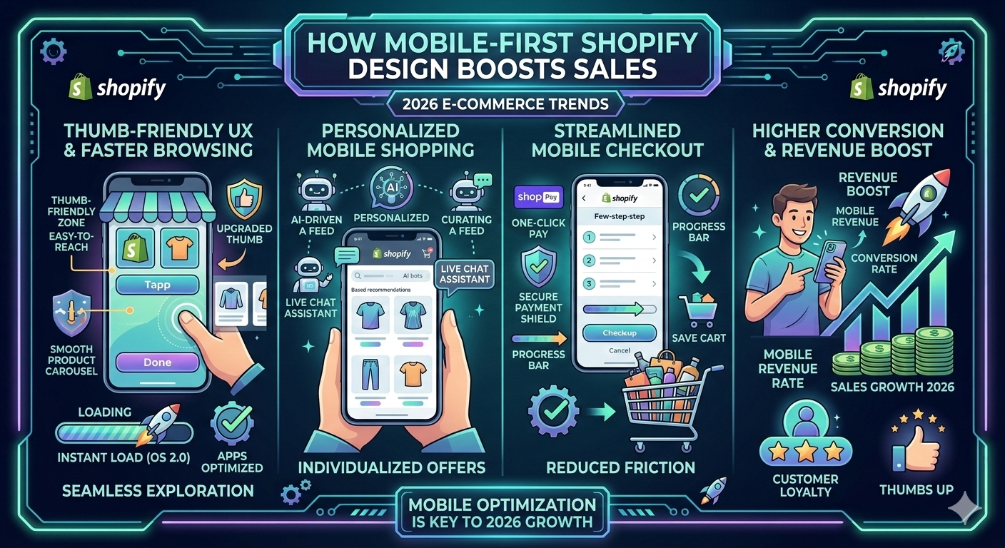
Mobile-first design is a strategy that prioritizes small-screen experiences during the design and development process. It emphasizes simplicity, clarity, and performance. Every element — from navigation menus to product images — is carefully structured to function perfectly on touch devices.Unlike traditional design approaches that adapt desktop layouts for mobile, mobile-first design starts with limited screen space in mind. This forces designers to focus only on what truly matters: clear product information, strong calls-to-action, easy navigation, and a frictionless checkout process. Touch-friendly buttons, simplified navigation bars, collapsible menus, and vertical scrolling layouts are all part of a mobile-first approach. This results in a clean interface where users can browse comfortably with one hand and complete purchases effortlessly. When the mobile experience is thoughtfully designed, scaling it to desktop becomes easier and more structured.Mobile users behave very differently from desktop users. They have shorter attention spans, scroll quickly, and expect immediate responses. If a page loads slowly or feels confusing, they leave within seconds. Because mobile traffic volume is so high, even small usability improvements can create significant revenue increases. For example, simplifying product pages, improving image clarity, or making the “Add to Cart” button more visible can noticeably improve conversion rates. Mobile-first Shopify design removes distractions and unnecessary clutter. It highlights product benefits, customer reviews, pricing, and checkout options in a seamless way. When users can find what they need instantly and move through the checkout process without obstacles, sales increase naturally. In eCommerce, convenience wins. And mobile-first design is built around convenience. Speed is critical on mobile devices. Mobile users often browse using mobile data connections, which may not always be fast. A heavy, poorly optimized store can take too long to load, causing users to abandon it before even seeing your products. Mobile-first design emphasizes lightweight layouts, compressed images, optimized scripts, and minimal unnecessary elements. Faster load times reduce bounce rates, improve engagement, and build trust. Search engines also prioritize mobile performance when determining rankings. Google’s mobile-first indexing means that your mobile site experience plays a major role in SEO visibility. A fast and responsive mobile store not only converts better, but it also ranks better. When performance and usability combine, both traffic and sales grow together. Trust is even more important on mobile devices. Smaller screens require sharper clarity and stronger visual hierarchy. If your mobile layout feels cluttered, outdated, or unprofessional, customers may hesitate to complete their purchase. Mobile-first design ensures readable typography, consistent branding, clean layouts, and clearly visible calls-to-action. Trust badges, secure payment icons, and easy-to-find customer support options further strengthen confidence. Because mobile users are often multitasking or easily distracted, the store must immediately communicate credibility. A well-structured mobile interface reduces doubt and makes the buying decision feel safe and simple. The smoother the experience, the stronger the trust. One of the biggest reasons mobile users abandon purchases is complicated checkout processes. Mobile-first Shopify design focuses heavily on simplifying checkout flows. Shorter forms, autofill capabilities, express payment options like Shop Pay, Apple Pay, or Google Pay, and minimal steps dramatically improve completion rates. Clear progress indicators and error-free form validation reduce frustration. Every second saved during checkout increases the likelihood of a completed sale. Mobile-first optimization ensures that purchasing feels effortless rather than complicated.
Mobile-First Design as a Long-Term Scaling Strategy
As your business grows and you invest more in paid ads, social media marketing, and influencer campaigns, most of that traffic will come from mobile devices. If your store is not prepared for high-volume mobile visitors, you risk wasting advertising budgets. Mobile-first design prepares your Shopify store for scale. It ensures stability during traffic spikes, maintains fast performance, and supports smooth navigation even as product catalogs expand. When your foundation is mobile-optimized, scaling becomes more efficient. Marketing efforts deliver better ROI because visitors land on a store that is built specifically for their device. At Zilancer, we design Shopify stores with scalability in mind — ensuring they convert effectively today while remaining adaptable for future growth. Mobile-first Shopify design is no longer optional — it is essential for modern eCommerce success. With the majority of customers shopping on smartphones, businesses that prioritize mobile usability consistently outperform competitors in engagement, conversions, and customer satisfaction. By focusing on speed, clarity, intuitive navigation, and frictionless checkout, mobile-first design turns casual mobile visitors into loyal customers. Investing in mobile-first Shopify design means meeting customers where they are, delivering seamless experiences, and building a store that is ready to grow sustainably in an increasingly mobile-driven world.