






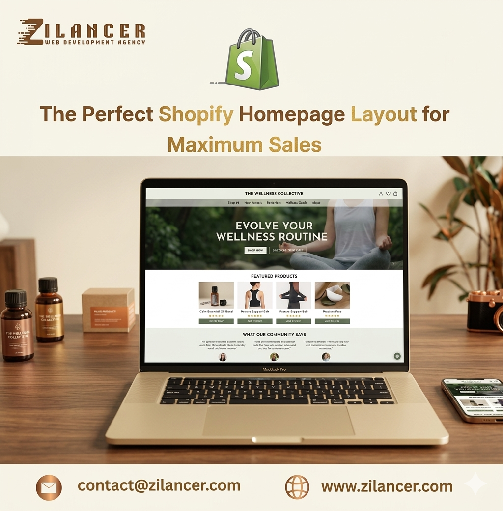
Your Shopify homepage is more than just a landing page—it is the entry point of your entire customer journey. It is where first impressions are formed, trust is built, and buying decisions begin. When a visitor lands on your homepage, they are asking one simple question: “Am I in the right place?” If your homepage answers that question clearly and quickly, users stay and explore. If it doesn’t, they leave within seconds. A perfect homepage layout is not about adding more elements—it’s about placing the right elements in the right order to guide users toward conversion.
At Zilancer, we design Shopify homepages that are structured to engage visitors, build trust, and turn clicks into sales.
Start with a Strong Hero Section
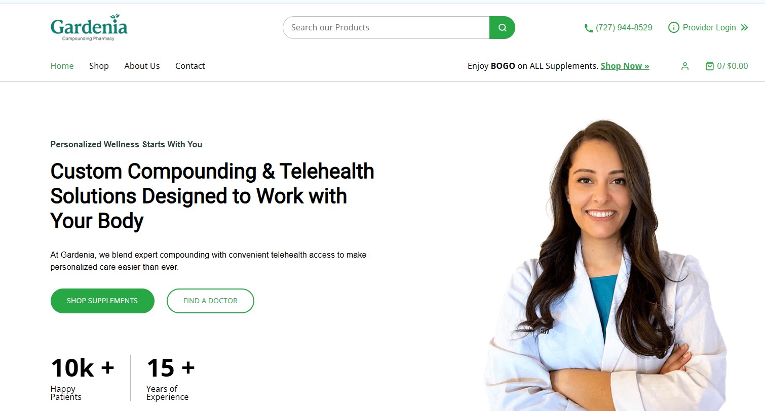
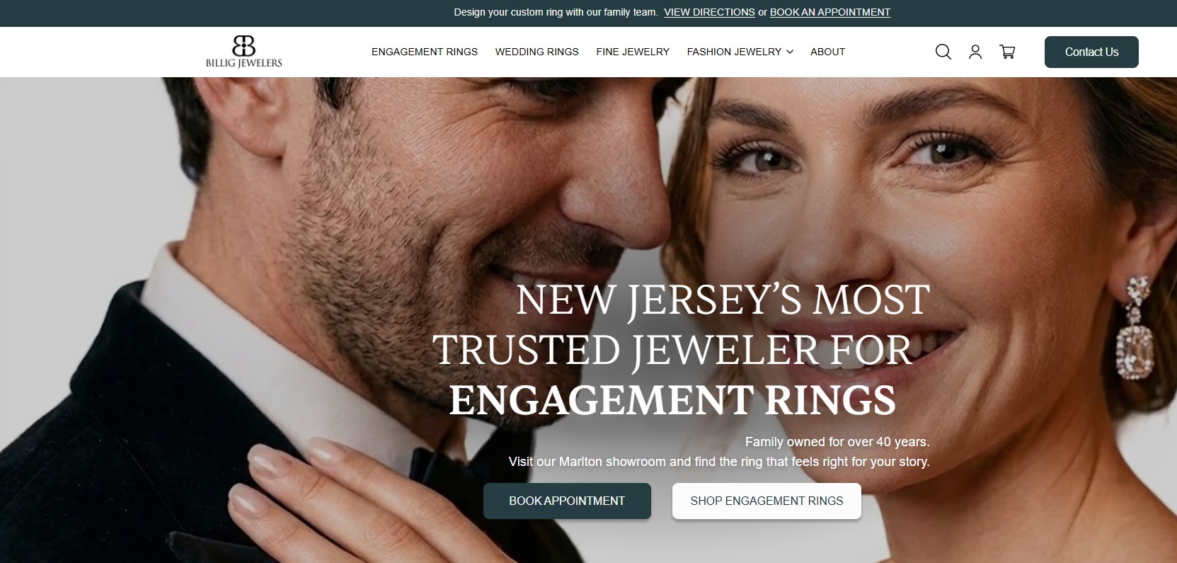
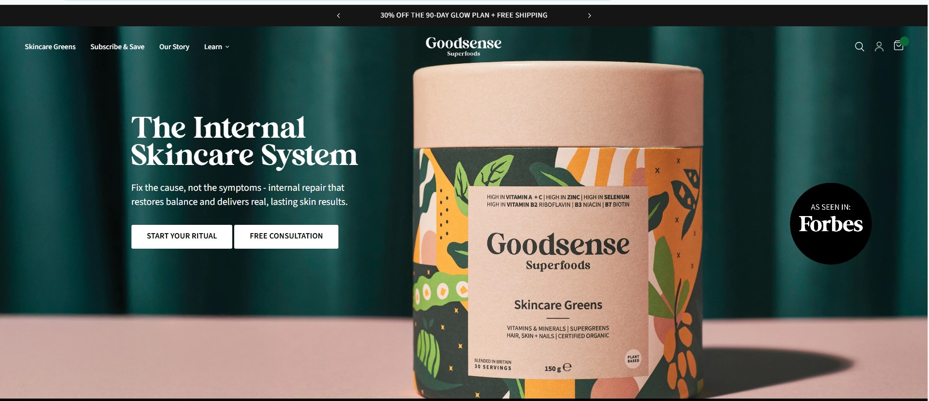
The hero section is the first thing visitors see, and it sets the tone for your entire store. It should immediately communicate what your brand offers and why it matters.
A powerful hero section includes a clear headline, a short supporting message, and a strong call-to-action. It should be visually clean and focused, without unnecessary distractions.
This section should answer three key questions instantly:
- What do you sell?
- Who is it for?
- Why should they care?
When done right, the hero section captures attention and encourages users to explore further. After capturing attention, the next step is to show visitors what you offer. Featuring your best-selling or most popular products helps build credibility and guides users toward proven choices. Instead of overwhelming users with too many options, focus on a curated selection. This creates clarity and makes decision-making easier.A well-organized product showcase increases engagement and moves users closer to purchase. Trust is one of the most important factors in eCommerce. Your homepage should quickly reassure visitors that your brand is reliable. This can be done by showcasing customer reviews, testimonials, or user-generated content. When visitors see that others have had positive experiences, it reduces hesitation. Trust elements placed early in the homepage create confidence and encourage users to continue exploring. Your homepage should not just sell products—it should communicate your brand. A short, clear brand story helps visitors connect with your business on a deeper level. It explains who you are, what you stand for, and why your products exist. This emotional connection can be the difference between a casual visitor and a loyal customer.
Use Clean and Structured Design
Using a clean and structured design is essential for creating a professional, user-friendly eCommerce experience that drives engagement and conversions. A clean design focuses on simplicity, removing unnecessary clutter so that users can easily focus on key elements such as products, content, and calls to action. By maintaining consistent spacing, clear typography, and a balanced layout, businesses can create a visually appealing interface that feels organized and easy to navigate. This not only improves usability but also builds trust, as customers are more likely to engage with a store that looks polished and well-structured. A structured design ensures that information is presented logically and predictably. Categories, menus, and page sections should be clearly defined so users can quickly find what they are looking for without confusion. Proper alignment, grid systems, and visual hierarchy help guide users through the page, making their journey smooth and intuitive. This is especially important in eCommerce, where a seamless browsing experience directly impacts purchasing decisions.
Additionally, clean and structured design plays a crucial role in mobile responsiveness. With a large portion of users shopping on mobile devices, a well-organized layout ensures that content adapts effectively to different screen sizes without losing clarity or functionality. It also improves loading speed, as minimal design elements often require fewer resources. Ultimately, a clean and structured design enhances user experience, increases engagement, and supports higher conversion rates by making every interaction simple, clear, and efficient.
Add Strong Call-to-Actions Throughout
Adding strong call-to-actions (CTAs) throughout your website is essential for guiding visitors toward meaningful actions and improving overall conversions. A well-crafted CTA clearly tells users what to do next—whether it’s “Buy Now,” “Add to Cart,” “Get Started,” or “Contact Us.” Without clear direction, even interested visitors may leave without taking action. Strong CTAs remove confusion and create a smooth path through the customer journey, helping turn passive browsing into active engagement. Effective CTAs are not just about the wording—they also rely on strategic placement and visual impact. They should be positioned at key points across the site, such as the homepage, product pages, and checkout stages, where users are most likely to make decisions. Using contrasting colors, readable fonts, and adequate spacing ensures that CTAs stand out without disrupting the overall design. At the same time, keeping the message concise and action-oriented increases the likelihood of clicks. Additionally, strong CTAs should align with user intent and provide value. For example, offering limited-time deals, free shipping, or exclusive discounts can create urgency and encourage immediate action. Testing different variations of CTA text, size, and placement can help identify what resonates best with your audience. Ultimately, well-implemented CTAs act as powerful conversion drivers, guiding users step by step and significantly improving the effectiveness of your eCommerce store.
Optimize for Mobile Experience
Optimizing for mobile experience is essential in today’s eCommerce landscape, where a large portion of users browse and shop using smartphones. A mobile-optimized store ensures that visitors can navigate, view products, and complete purchases and efficiency on smaller screens. This starts with responsive design, where layouts automatically adjust to different screen sizes without breaking structure or usability. Clear menus, readable text, and properly scaled images help create a smooth and frustration-free browsing experience. Speed is a critical factor in mobile optimization. Mobile users expect fast-loading pages, and even a slight delay can lead to higher bounce rates and lost sales. Optimizing images, reducing unnecessary scripts, and using lightweight design elements can significantly improve performance. Touch-friendly interactions are also important—buttons should be large enough to tap and forms should be simple to fill out without excessive typing. Checkout optimization for mobile is equally crucial. Features like guest checkout, autofill options, and mobile-friendly payment methods make it easier for users to complete their purchases quickly. Reducing steps and eliminating distractions during checkout can greatly increase conversion rates. Ultimately, optimizing for mobile experience is not just about design—it’s about convenience, speed, and usability. By creating a seamless mobile journey, businesses can engage more users, reduce drop-offs, and maximize conversions in an increasingly mobile-first world.
Improve Speed for Better Performance
Improving speed for better performance is essential for any eCommerce store, as it directly impacts user experience, search rankings, and conversion rates. A fast-loading website keeps visitors engaged, reduces bounce rates, and increases the likelihood of completing a purchase. In contrast, slow websites frustrate users and often lead to lost sales. Even a delay of a few seconds can significantly affect how customers perceive a brand, making speed optimization a critical priority. One of the key ways to improve speed is by optimizing images and media files. Large, uncompressed images can slow down page loading, so using properly sized and compressed visuals helps maintain quality while improving performance. Minimizing unnecessary apps, scripts, and third-party integrations also plays a major role, as too many external resources can increase load time. Clean and efficient code further ensures that pages render quickly and smoothly.
Additionally, leveraging caching, content delivery networks (CDNs), and reliable hosting infrastructure helps deliver content faster to users across different locations. Mobile optimization is equally important, as a significant portion of traffic comes from smartphones, where speed expectations are even higher. Regular performance testing and monitoring allow businesses to identify issues and continuously improve their site speed. Ultimately, a fast and responsive store not only enhances user satisfaction but also builds trust, improves SEO, and drives higher conversions, making it a key factor in long-term eCommerce success. Ending with a strong closing section is essential for leaving a lasting impression and reinforcing the core message of your content. Whether it’s a website page, case study, or sales copy, the conclusion should clearly summarize key points while guiding the reader toward the next step. A powerful closing doesn’t just repeat information—it brings everything together in a way that feels purposeful and impactful, helping readers understand the value of what they’ve just read. An effective closing also includes a clear and compelling call-to-action. This could be encouraging users to get in touch, explore services, make a purchase, or take the next step in their journey. The goal is to maintain momentum and prevent the reader from dropping off without action. Using confident and benefit-driven language helps create a sense of urgency and reinforces trust in your offering. Additionally, a strong closing should align with your brand voice and leave the audience with a positive, memorable impression. It’s an opportunity to highlight your expertise, commitment, and the results you can deliver. When done right, the closing section becomes more than just an ending—it becomes a conversion point that turns interest into action and helps move your business forward.
How Zilancer Designs High-Converting Homepages
Zilancer designs high-converting homepages by combining strategy, user psychology, and performance-focused design to create an immediate impact on visitors. The process begins with understanding the target audience and business goals, ensuring that every element on the homepage serves a clear purpose. Instead of cluttering the layout with unnecessary sections, Zilancer focuses on a clean, structured design that highlights key messages and guides users naturally through the page. A strong hero section with a compelling headline, clear value proposition, and a prominent call-to-action sets the tone, helping visitors quickly understand what the brand offers and why it matters. Visual hierarchy plays a major role in their approach. Important elements such as featured products, benefits, and trust signals are strategically positioned to capture attention and build credibility. High-quality visuals, consistent branding, and well-balanced spacing create a professional look that encourages users to explore further. Zilancer also integrates social proof, such as customer reviews and testimonials, to strengthen trust and influence purchasing decisions early in the journey. Performance and usability are equally prioritized. Fast loading speed, mobile responsiveness, and intuitive navigation ensure that users can browse effortlessly across all devices. Each section of the homepage is designed to reduce friction and move users closer to conversion, whether it’s exploring products, learning more about the brand, or taking immediate action. Continuous testing and data analysis allow Zilancer to refine layouts, messaging, and CTA placements over time. Ultimately, Zilancer’s approach is not just about making a homepage look good—it’s about making it work effectively. By aligning design with user intent and business objectives, they create homepages that engage visitors, build trust, and drive consistent conversions.
The perfect Shopify homepage layout is not about complexity—it’s about clarity and flow. When every element is thoughtfully placed and aligned with user intent, the entire experience becomes effortless and engaging. By combining strong first impressions, clear product presentation, trust-building elements, and smooth navigation, you create a structured journey that naturally guides visitors toward action. Each section works together to remove confusion, build confidence, and keep users moving forward without friction. A well-optimized homepage does more than just look good—it performs. It captures attention, communicates value instantly, and creates a seamless path from discovery to purchase. This is where most customer journeys begin, and making that first interaction impactful can significantly influence conversion rates. If you want to maximize your Shopify sales, start by refining your homepage with a focus on clarity, usability, and purpose. And with Zilancer, you can create a homepage that is not only visually impressive but also strategically designed to convert visitors into loyal customers.